Presentation only have 2 paragraphs of text. Which could be more.
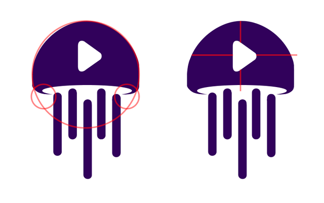
About the design itself, play icon looks like randomly placed, it's not centered in any axis. I've tried to edit and examine a few changes but since you used masks to design it, it makes it too hard to edit.
I personally wanted to smooth the pointy edges to follow the overall circular flow but as I said, it wasn't easy to produce with the masks you applied.
The shape also is not circular, I'm not sure if there is any specific reason for it. When designing for small spaces it's better to follow geometric shapes if possible to avoid pixellated look.
Finally, I saw that project owner requested for a little adjustment to fill a square space, but I guess you just provided the editable files for him to make the changes?
Can you adjust the proportions so the overall shape looks more like a square?
https://github.com/btzr-io/jelly-beats/issues/16#issuecomment-406887006
Your contribution has been evaluated according to Utopian policies and guidelines, as well as a predefined set of questions pertaining to the category.
To view those questions and the relevant answers related to your post, click here.
Need help? Write a ticket on https://support.utopian.io/.
Chat with us on Discord.
[utopian-moderator]
Thank you for your review, @oups! Keep up the good work!