Logo For LaunchMenu

Repository
https://github.com/LaunchMenu/LaunchMenu
Previously I offered a logo on another project (Conversation Link 1). But the project already has a logo, then the project owner asked me to design a logo for his project called LaunchMenu.
After I designed the logo and discussed it, the project owner liked and accepted it. (Conversation Link 2)
Conversation Link 1
Conversation Link 2
Pull Request
Details
LaunchMenu is an open source utility application similar to LaunchBar and Spotlight for Mac.
The aim, to bring all important utilities (applets) to your fingertips. For us having utilities quickly accessable via the keyboard is vital, however we will also support usage of the mouse.
LaunchMenu runs in the background. Upon pressing ⌘ + space/⊞ + space a menu opens allowing you to type a query. Queries are used to open different applets.
This project is licensed by MIT. This app runs on Mac, Windows and Linux platforms.
Logo Result


Benefits / Improvements
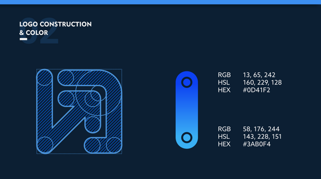
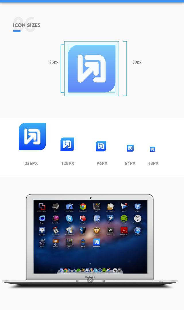
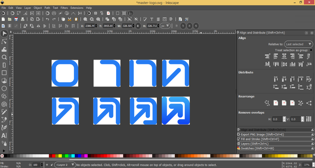
This logo is designed using a simple, modern, elegant and unique style. So that it displays a logo with an easy to remember.
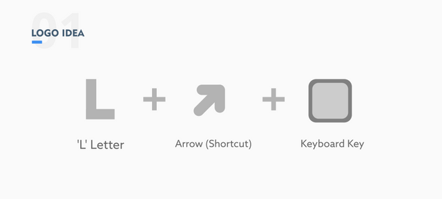
The logo is inspired by the letter L, an arrow icon and a keyboard button icon.
The letter L is taken from the initial name of this app 'Launch'
Arrows represent shortcuts and fast access.
The keyboard button symbolizes, that this app can be accessed with a shortcut key combination.
In the color selection, the blue gradient color is selected. Blue symbolizes a technology and speed.
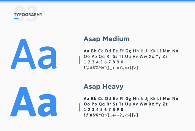
And the font used is the Asgap Font. With Heavy type on "Launch" and Medium type on "Menu".
Proof of authorship
Tools
Inkscape (Logo Design) & Adobe Illustrator CS6 (Export to other vectors)
Original files
Drive Link
Font Link
Mockup Link
Proof of Work Done

This work is licensed under a Creative Commons Attribution 4.0 International License.
Hey @zularizal ,
Thank you for the contribution.
Everything looks fine. Logo design shows the function of the project clearly.
Only thing I am not sure about the space between the arrow and top-right corner. It may looks better, if you make the space bigger and the arrow smaller, but it is only suggestion.
I appreciated your work..
Your contribution has been evaluated according to Utopian policies and guidelines, as well as a predefined set of questions pertaining to the category.
To view those questions and the relevant answers related to your post, click here.
Need help? Chat with us on Discord.
[utopian-moderator]
Yes, that's a good suggestion. Thanks.
Thank you for your review, @baranpirincal! Keep up the good work!
Hi @zularizal!
Your post was upvoted by @steem-ua, new Steem dApp, using UserAuthority for algorithmic post curation!
Your post is eligible for our upvote, thanks to our collaboration with @utopian-io!
Feel free to join our @steem-ua Discord server
Hey, @zularizal!
Thanks for contributing on Utopian.
We’re already looking forward to your next contribution!
Get higher incentives and support Utopian.io!
Simply set @utopian.pay as a 5% (or higher) payout beneficiary on your contribution post (via SteemPlus or Steeditor).
Want to chat? Join us on Discord https://discord.gg/h52nFrV.
Vote for Utopian Witness!