Making A Book Cover Part II
I spent some time working on my book cover for the next installment of The Mechanical Bird today.
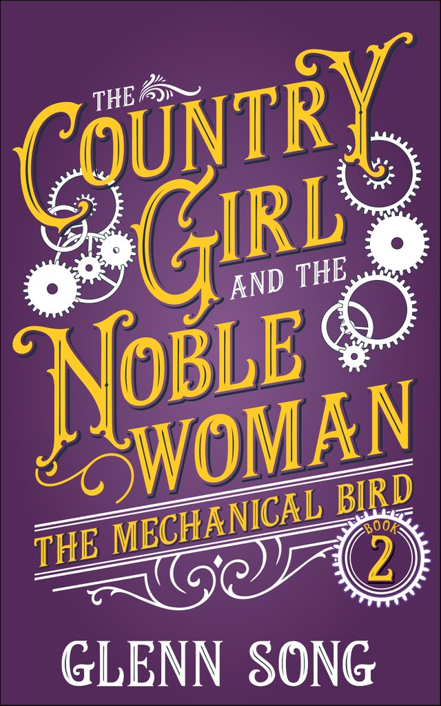
That cover and title "The Country Girl and Noblewoman" is what I'm going with. It plays on the "The Tale of Two Ladies" title from the first book. The other books after this would also be named similarly to give you a hint to the progression of each character's story arcs.
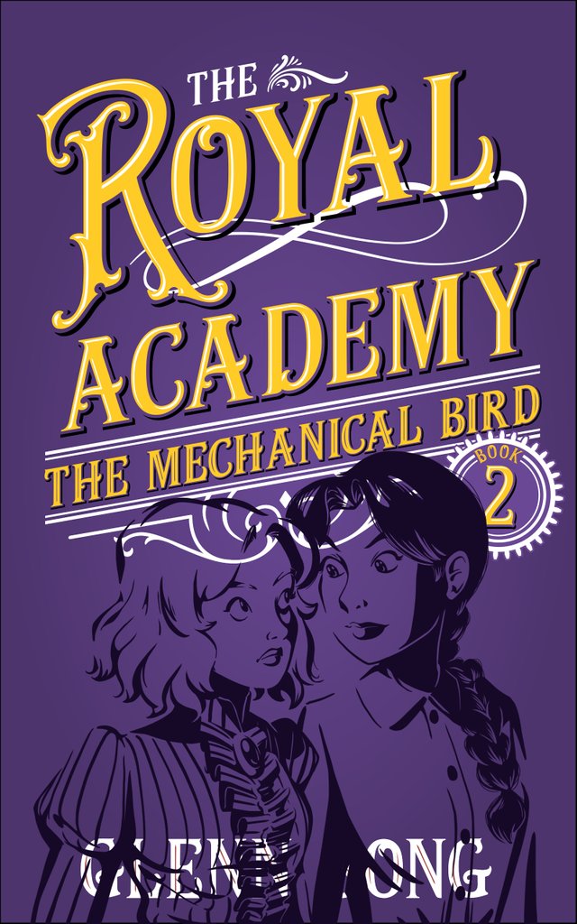
The working title was "The Royal Academy" -- hence the royal purple and gold. I had a lot of space leftover on the old cover so I toyed with doing an illustration of both characters to fill that space. But yesterday while walking through Santa Monica I came up with a different title (the one above) and it fills the entire cover. I like the idea that it's purely a typography thing and gives me more words to play with. Maybe I can switch out some of the gears and do something else -- I kinda have an idea for that.
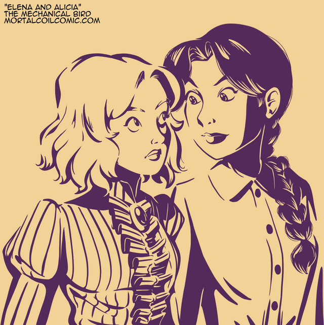
As for the illustration, maybe I'll include it in the back of the book, but it only adds more memory to the download and besides, I'd rather you imagine the characters the way you want.
Lastly, that's the old cover. I made that back in February 2017 with the emphasis on the series name. If you can imagine, seeing, say 6-7 of these books with only the series name in bold you might think they're all the same book and be confused. I want to use a similar typography style (and that dope-ass slant for the text) and similar artwork (i.e. gears, silhouettes, swirls, etc) to remind you that it's in the same series. Plus the series name is secondary on the cover.
I'm on the verge of releasing this book. It'll be Amazon Kindle only. I want to read the text again, but maybe it's time to let this one go. It's far from perfect. I'm sure there's still a hundred grammatical errors and a bunch of inconsistencies and spelling errors too, but you know this is a shoestring operation. I'm going to go with what I got.
upvote for me please? https://steemit.com/news/@bible.com/6h36cq
Hey :)
You are absolutely right about the title changes all around!
As to the use of the illustration, the plain cover leaves no impression of the story plot. It could be a story of conflict or a story of friendship.
The cover with the illustration definitely hints of conflict.
The title change alone sets up a situation of dichotomy and contrast and is intriguing to the mind. The illustration, however, pulls at the emotions.
So, using the illustration on the back could increase sales. It wouldn't meet your objective to allow the imagination full range BUT illustrations also give the imagination a starting place for weaving. Your choice to do a sketch style illustration provides a great spark to the imagination.
I will also tell you that when I was reading as a teen and preteen, I enjoyed illustrations. They allowed me further into their world. Some of the best illustrations were of what the character saw without including the character.
As to increasing the size of the download - Small illustrations are not as heavy as you might imagine. Also, check and see how the Kindle handles images with transparencies. Some years ago I use to save transfer data by turning white transparent in png files. This technique would be perfect with your sketches. But again with today's technologies, I seriously doubt it's worth the effort.
I have a couple of design suggestions, too.
First, don't forget there is also art in the placement and use of white space. The top cover feels, to me, like it didn't know what to do with the space so it just stretched out all the lettering. I'm not having great inspirational thoughts on how to adjust it. Perhaps ask the Internet about "white space on book covers" or in typography. Ahh better yet, ask about the "psychology of typography design". That should surely be interesting.
Second, about the gears, they are both the blessing of instant association to steampunk and the curse of cliche. This is true.
How about this? Since its also the mechanical bird series, what about 3 or 4 gears that hint at a bird shape? For that matter, maybe stick some feet and a break on that shape, perhaps in some slightly detached sense, even. Maybe.
I'm glad I bumped into you and your work. I just wish I knew how I got here. ;-)
Hey! Thanks for the thoughtful response. I definitely want to include the illustration in the book and you're right it's probably not a big deal memory-wise, and besides...I already have two other images inside the book for maps of the world. Amazon will tell me if there is an issue when I go to upload it. I did have an idea for a gear and wing icon that might serve the story nicely, but that might be an asset to create for the next installment.
The slanted text makes that upper right hand corner look bare, I'll have to figure out something for it. More gears? ;) I might also replace some of the gears. It depends, I'm looking to ship this book and start on the next one. It may not be perfect, but it's better than the previous covers.
I've toyed with the idea of adding more illustrations. I like the idea of doing something like a Japanese light novel, but I don't know how well self-published light novels sell on Kindle. I suppose most people don't do them, because they're authors first and not author/artists. Plus, I know the self-pub crowd on there tends to write to market and iterate fast, so doing a few illustrations for a book would be out of the question.
That could mean it's a niche market to make a name in...