You are viewing a single comment's thread from:
RE: [CONTEST] Looking for new profile cover images
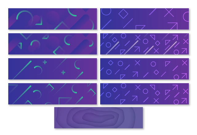
Well it was harder than I thought, I randomly worked on a 1920x480 canvas, here are some alternatives. Open to any adjustments. Don't forget to check out mockups on condenser
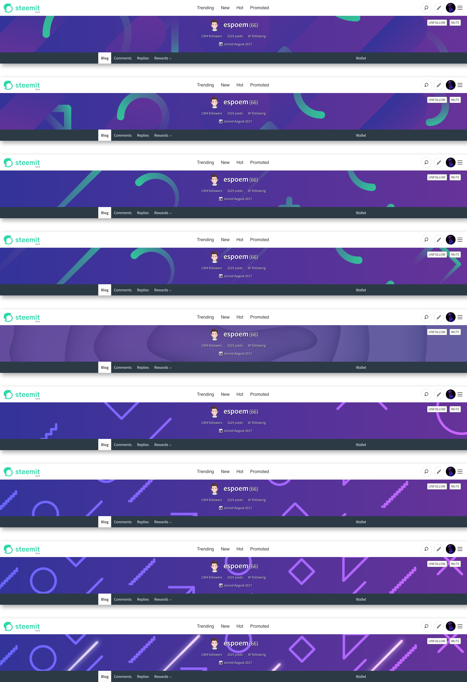
I've made a quick mockup of condenser's UI for myself to work quickly, anyone interested could download it from here
So many variations. :D I like the right column more in general. To be honest, the last image isn't my favourite as it displayed in here. However, I must admit that it looks good in the mockup. I think that condenser has the narrowest cover images of all apps. Is it possible to see it in steempeak as well?
Anyway, I'd say that I like the second from the top right the most but I also like how the circle from the image above looks like in the mockup.
I'm glad you didn't hate them :) I realized I wasn't working on a suggested color scheme when I was in the middle of the work.
Latest image actually work with multiple colors, but I didn't think it would fit that way so let's forget about it.
That 2nd one from right column was the latest iteration actually. It made me smile that at least I was going in right direction.
As you said condenser probably has the narrowest height after busy, and specially in your profile, since you didn't have any description text and location etc. Those at least add 70-80px to that space. Sure I'll try it with steampeak as well as mobile views. (I'm thinking about preparing major steem front-ends mockup btw. for general use)
Any further suggestions about colors, maybe icon sizes and density?
The density is fine. As I said, I like the circle(s) going outside the image but that would probably require to balance the sizes.
Covers on SteemPeak, one thing to mention, mockups are not precise but close to original ones as possible (especially for steempeak I tried to replicate the dark gradient coming from buttom, it's not the same values in css and photoshop). And images I use in those mockups are not full-quality exports but just quick screenshots. If you find some little fuzziness or distortion on some details, they won't be there with normal exports.
Thanks, @oups. Seeing these images, I am convinced that the second from the right top (original order) is the best choice from the list.
You're welcome, alright I'll try to focus on that one if I feel like to iterate and have some alternative colors. And applications of mobile versions. Don't worry there are two days ahead and you can expand the deadline, if you don't like the proposals.
I think big guns saving themselves for the last day. ;)