Logo thing with a rocket [Design]
I have grown quite lazy in my old age, working 9 to 5. Something I demanded when I started or else it would be 8:30 to 5.
Back in my young days I enjoyed designing and would jump at every opportunity I got to design things, especially logos. Although I find them quite challenging and rather fucking boring, to say the least.
Speaking of boredom, the reason for this shitpost is because I was bored today, or is that procrastinating, so I actually did some work - which is not my actual work - at work, best is I am even going to get paid for it.
So onward to the logo I didn't just tell them to go down the street for.


Personally I prefer the pink - it was a total after thought to even offer another option but I am nice like that.

Because we have to see how it looks when it is made all tiny since the kiddos have tiny little eyes.
I am Penderis and proud to be part of @BuddyUp if you wish to know more about this great community head over to our BuddyUP server. You can do this by following the SafeLink post here.
We all grow together

Back in my young days I enjoyed designing and would jump at every opportunity I got to design things, especially logos. Although I find them quite challenging and rather fucking boring, to say the least.
Speaking of boredom, the reason for this shitpost is because I was bored today, or is that procrastinating, so I actually did some work - which is not my actual work - at work, best is I am even going to get paid for it.
So onward to the logo I didn't just tell them to go down the street for.
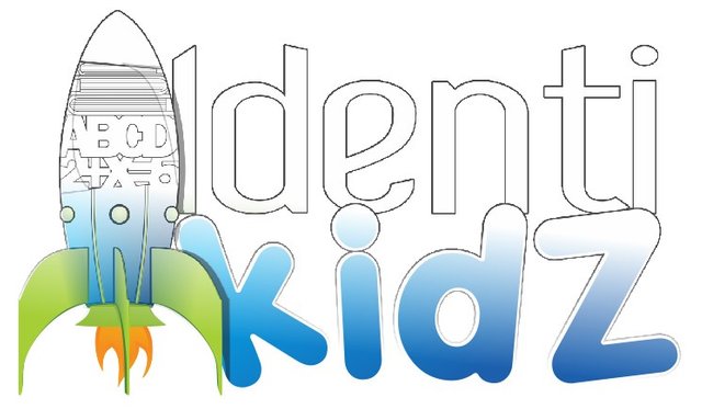
Identi Kidz
Assisting children with learning dissabilities, helping them better their school work and provide therapy in extreme situations.
mmmm... much more descriptive than helping slow children, most likely also more accurate.
Because we have to see how it looks when it is made all tiny since the kiddos have tiny little eyes.
They don't see things as big as we do.
The main idea is still education but she mentioned the therapy which makes the reason for the rocket more a boost, the children are still in primary and very few will be in high school, which usually means they are already lost to this cruel world.
Included as samples are the full colour versions on both black and white, the single colour versions as only black or white with the appropriate backgrounds.
Why 2+X ?
Because I can.
Dear friend, you do not appear to be following @artzone. Follow @artzone and get added to our voting list for valuable up-votes!
Love the logo! I'm partial to the pink version (gee I wonder why) or the white on black background.
That's really great they are helping children with disabilities, it's a cause near and dear to my heart. They are capable of so much with the right help.
Nice Work Mr. Pen!
XXXOOO ~T
Haha funny how you also say the white on the black background, she did the same thing. I like the pink one more also.
When it comes to logos, there are only the colour options the rest I just include because some documents don't need full colour so I will include either a greyscale or single colour version for embroidery, press work or which ever work that does not require full colour that way you have control of the look .
else people will convert it as is to a single colour or greyscale version , which would look quite shitty especially in logos with gradients where the colours once converted have no real contrast.
Yep! grayscale does look bland. Blah.