Approval Of The Gridcoin Logo Redesign
Hello fellow comrades !
The Gridcoin community approved the redesign of the Gridcoin logo. At least the ones that took the time to vote... ;)
(Discussion is here)
It was definitely an important vote. The new logo would be the future symbol of Gridcoin and, we will see it at each future event. Everybody knows how much is important for a cryptocurrency to chose wisely its logo.
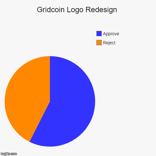
Gridcoinstats tells us that the poll was fairly close (57.45% for and 42.55% against) but the ratio of the number of people that actually voted is clearly favorable to redesign (241 for and 31 against ≈ 88,60% ). Of course, the ratio of the number of people voting has nothing with Gridcoin's voting system. Gridcoin has good reasons not to give the same power to new entrants and early investors and I'm completely ok with that.
Now, even if the vote shows a slight preference for redesign. It would be interesting to better understand why the logo does not have massive support. Maybe another survey?
I do not question the outcome of the poll, but a logo is something that needs a large membership from the community. It would be a pity if Gridcoin were content with a slight majority.
That's all folks !
Feel free to  !
!
EDIT : I have nothing against people who have refused or approved the design. I try to understand what miss to the new logo to be adopted to the whole community.
I think there are a few quick things we can take away from this poll:
There is a community willing to do work to build Gridcoin. A community that believes in what Gridcoin represents enough to volunteer their time for ambitious endeavors. For science!
The complex logo will be used along side the simplified logo. No one dislikes the complex logo -- in fact most everyone loves it. However it works best in specific situations and actually fails in others. It can not scale clearly to the size of a ticker icon or taskbar and tray icons. It works perfectly, however, for things like 1 Million Block Commemorative Coins ;).
Gridcoin is open to honest and transparent debate. Yes, most people voted in favor of the simplified logo, but it would have taken only a few heavily invested entities or even just one voting its full weight to outright reject the proposal.
There needs to be better avenues for discussions. There were many heated and productive conversations when Branding was designing the logo in the proposal, however these discussions were limited to those already aware of slack. It proved fairly difficult to maintain a presence on all the platforms the Gridcoin community uses. Once the proposal was put up for a vote, there were more discussions, but scattered across all the platforms. This might not be something we can fix completely, and I actually think the more community hubs that exist the better, but @neuralminer has set up a nice port between IRC and slack and I think he's done some telegram magic as well, so maybe we can think of some similar options.
Personally, I agree with you @chronosamoht, I would love to know why those who vote no vote no. But like you said, some people prefer to vote quietly and that's fine. I would encourage people who disagree with any poll to speak up and say why. The respect given to those who speak up, no matter what they think, cannot be put into words. After all, how are we supposed to build something for everyone if some people never say what they want?
Keep an eye out for Branding Update #3 for more information!
And prepare to have your socks blown off.
You just put it all in so good words. Can't agree more with you! The community is a caring one and all wish to see it thrive and flurish.
There is definitely room for more discussion and talks of how the community should and could use these logos in harmony in the best ways possible.
I don't think people say nay for it not looking good. I think they say nay for changing the brand.
Addition
Personally I'm for the new design and rebranding of the whole wallet and system. I can however see using the current logo and brand as an addition on special wares and goods.
So, I actually asked a guy in the IRC channel why he voted no. He wasn't happy about being asked, but that's the breaks when it comes to these types of things. Plus, why be ashamed of your vote assuming you have reasons for doing it?
Anyway, the guy said that he didn't like that it was essentially giving the marketers a path towards being reimbursed for the work that's been done. It sets a "precedent."
There wasn't any discussion beyond that... I was essentially told to stuff it.
My take is that some people don't feel that the logo, while nice, is something that should be reimbursed. I don't know what that has to do with this vote. I understand the sentiment that it sets a precedent for reimbursement, but more so, that those that have power due to the logo will retain the power. THAT is the actual issue; they don't want the marketing/branding people to retain the power they've just created for themselves.
As I mentioned in another post, the GRC folk that have put in work feel ownership over Gridcoin. It's a problem for them to see others coming in and changing or completely removing things that they've owned and contributed previously. People don't like to give up or even share power. Even people that would normally be considered the exact opposite of caring about those things...
Personally, I love the logo, and I'm super happy it went through. Maybe gridcoin can actually progress now instead of just remaining stagnant, particularly when it comes to marketing. I, for one, am glad a precedent for reimbursement has been established. To me, it seems that things don't really get done otherwise.
Interesting perspective - thanks for asking and getting the feelers out there. This just sounds like the person misunderstands what has happened.
While I can see that as a valid concern, it is baseless. There is no official reimbursement for marketing at all, and the only funds received by anyone as a result of this work was donations.
As a matter of fact, when the topic was last raised Joshoeah explicitly did not want to raise a Foundation expense poll.
That being said, on a personal note I think work like this should be reimbursed to some extent. That is a whole separate topic to this logo though.
To echo what @dutch and @jringo have already said - as the designer here, I have volunteered my time with no expectation of reimbursement, solely as a way for me to be involved in a project I heavily support. My reward comes from contributing personally to the project by using the skillset that I have to offer and seeing my work go out into the world - exactly why I do any design work.
This misunderstanding is very unfortunate - not to mention something that could very easily have been cleared up with a little transparency and discussion. Hopefully the individual involved will see this, or see our dedication to Gridcoin, and reconsider their opinion :)
Thanks for reaching out!
I'm with @dutch. I don't see where this person sees a path toward foundation reimbursement. The idea of being reimbursed for this logo work has never been brought up in more than a "I'd support" tone. The general agreement is that this is volunteer work. We are investing time into the project instead of cash with the intention of speeding along adoption.
Our work is volunteer and donation based.
Backend Dev work is compensated.
Maybe in the future there will be some sort of reimbursement for projects other than backend dev, but we are not operating under the assumption that if we build it we will get paid.
I too would love to hear counter-arguments to the new logo, especially from large investors (I refuse to call them "whales", which always sounds derogatory to me) . To me, a simple cruncher, the new design was obviously an improvement, so it makes me wonder "What am I missing, that maybe turned off the larger investors? Are there angles to this new design that I hadn't considered?"
Unfortunately, I don't see any counter-arguments in the discussion thread. And a big "reject" just doesn't give me enough information to go on. I'd feel so much better with an overwhelming majority vote. But then again, nobody really owes anyone an "explanation" for their vote. It could just be they didn't like the aesthetic. I think talking about these differences openly is much better in the long run. Better to disagree in a civil manner than developing an "us versus them" mentality between the crunchers and the investors. We're all on the same team.
Actually, I didn't found my post offensive for people rejecting the poll. I'll rewrite some part of the post because it's clearly not what I wanted.
On the contrary, I do not find the new logo "perfect". Notably the hexagonal shape seems strange to me for a coin.
For people that stayed silent after the release of the logo, maybe they did not want to break the atmosphere while everyone was looking forward to the new logo.
Your post was fine, I didn't take it offensively at all. I was merely layering my own thoughts on top of the subject. I did not mean to put words into your mouth, so sorry if it came across that way.
I'd be careful to interpret it like that
You're right. But I see no reason to do that because it does not affect the vote. Unless people like to use multiple accounts.
There might me one counter-argument:
Believe it or not, that was a huge topic of contention as we were working on the project. I agree with you %100: Gridcoin, BOINC, is not only biology. The problem came when we tried to find some sort of imagery that could represent everything that BOINC is used for. Sociology, politics, math, chemistry, physics... there's so much! We could not find the right imagery to depict grid computing while maintaining the ability to scale. The compromise is in the G itself: it uses a transparent background so themes can be placed behind it. Here's an example (an old mock-up used just to demonstrate the utility):
This failure of the simplified logo is where the more complex logo comes into play.
There will most likely be better examples of this combination as we develop the media packs.
Also I like the idea that a person's DNA contains a lot of information to make them who they are. In this case Gridcoin is almost like a foundation which represents so many different things being done. I personally love the new logo also.
I like the new design it for sure is 10 times better then the old design which looks so dated. Maybe it will breath some new life into the coin because its fallen hard over the last few weeks
beautiful, just beautiful