Testing the Mobile Version of Proposal-86
In his latest update, @the-gorilla called out:
Please let me know what you think and also ping me on Discord if you'd like first sight of the Mobile Version.
So I didn't hesitate to reach out to @the-gorilla to test the Mobile Version. I originally planned to write a review exclusively for him in Discord, but then I decided to post it here so that maybe more people would be interested.
It is worth noting that during testing I used an extremely old mobile phone, on which Android has not been updated for a long time due to the fact that it is no longer supported. But that didn't stop me from successfully being one of the first to see the Mobile Version 😛.
Login
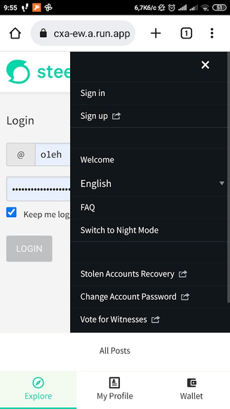
So the first thing I saw when I followed the link @the-gorilla gave me was this:
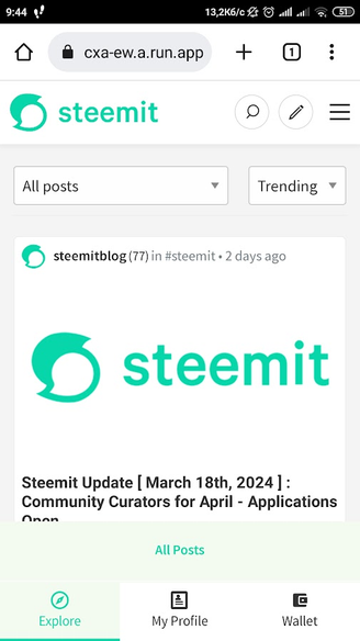
At the bottom of the screenshot you can see the updated navigation, which is intuitive. Since I'm not really interested in the All Posts section, I immediately went to my profile. The login page has opened:
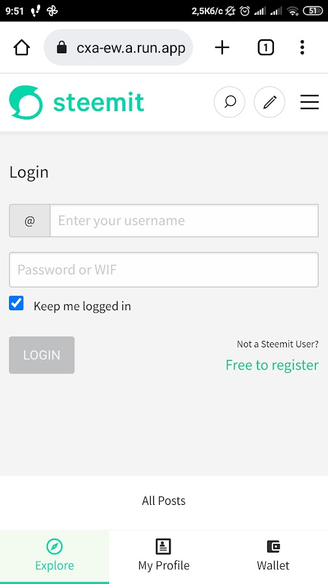
However, when I entered my details, the login button never became active:
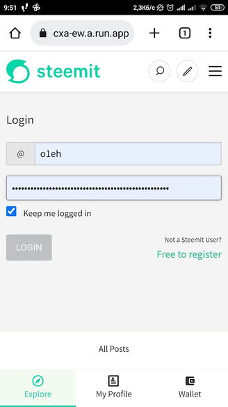
I reported this to @the-gorilla and after a while he figured out that you can log in using the hamburger menu.
With this method, I successfully logged into my profile. And @the-gorilla will have to work on the problem of the login page.
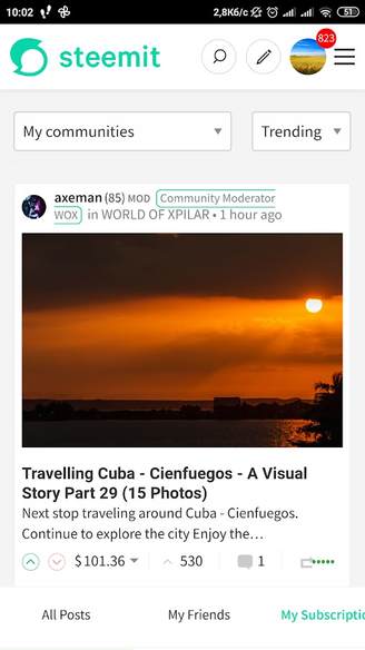
After Logging In
After entering your credentials, you will be taken to the My Subscriptions page.
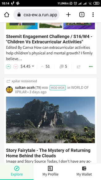
I didn't notice it at first, but when I started scrolling through the posts feed, I saw the full version of the bottom navigation, which looks like this:

So, as you can see, we have three navigation points:
- Explore
- My Profile
- My Wallet
and two of those items have sub-items.
Explore
The Explore navigation item has three sub-items:
- All Posts
- My Friends
- My Subscriptions
Personally, I don't use the All Posts and My Subscriptions pages, so I immediately went to My Friends. Here I saw the usual feed of subscriptions, which I use the most. It is interesting that in order to increase the free space, the All Posts, My Friends and My Subscriptions buttons were hidden:
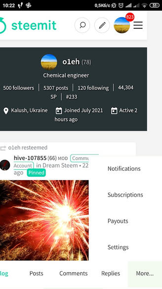
My Profile
Let's go to the My Profile section. Here, the navigation is organized as follows - the most popular buttons appear at the bottom:
- Blog
- Posts
- Comments
- Replies
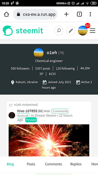
You can find the rest under the More button.
Some Conclusions
I think it's no secret that the mobile version of any site is now more important than the desktop version. Most people read and curate from their mobile devices, and some even write posts. Therefore, the convenience of the mobile version plays an extremely important role.
Is it possible to work from mobile in Steemit now? Yes of course. Am I more comfortable with the changes made by @the-gorilla? Certainly! With the new navigation, all the most needed elements are, so to speak, at hand. The addition of icons made the panel more intuitive, and the new design resonates more with modern mobile pages of other sites.
Personally, I liked the new navigation and I did not find any shortcomings that I could talk about here. So my feedback isn't very helpful to @the-gorilla. However, that's why I posted this, to encourage you to test the Mobile Version yourself and give your opinion. To do so, contact @the-gorilla on Discord.
And the last thing I wanted to say. I am a bit alarmed by the silence of the Steemit team regarding this project. I don't think they support it. There are probably reasons for this. I would not like all this work to be in vain. In any case, if this project is not destined to be completed, I believe that changes to the navigation in the mobile version should be made. Even now.
First tell me, why you have eight hundred and twenty three unread notifications? 🫨
Regarding @the-gorilla's mobile version, I think the design is great. All the important menu options are within thumb's reach, increasing the agility and ease of navigation. I'm happy he chose to stick with the basic steemit.com theme, not making the mobile version overwhelming.
P.S. I missed the login error because my hands automatically made me log in from the top right hamburger menu. 🥴
I asked him the same question about the notifications but I'm not telling you his reply.
Wow,I will have to test the mobile version as I am more of. Mobile user 😆
That's an excellent question.
Recently there were more than 4000 unread messages 😀.
The answer is very simple. For reasons unknown to me, I don't use notifications in the Steemit interface. I find it more convenient to view everything with steemworld. That's where I see who writes me comments, mentions me in posts or comments.
I also think that the changes made are appropriate and useful. I wonder if @the-gorilla intends to change something else 🤔. I, for example, have no more ideas.
I do the same but I make sure to clear up the notifications to satisfy my compulsive brain.🤪
P.P.S. You-know-who is deaf more than ever.
Thank you - your feedback is very helpful even if you would have like to find more faults 😉
I noticed in a couple of your screenshots that parts of the secondary navigation are getting cropped, which shouldn't be happening. Particularly in the last screenshot where selecting "More..." appears to have moved the screen across. Do you know what resolution your phone is?
When at the top of the page, the secondary menu gets cropped but when we scroll down, primary menu appears and it adjusts itself to the screen.
Does the primary menu disappear again when you scroll up?
Not at once, it disappears when I can't scroll anymore (at the start of the page) and that's when the secondary menu gets cropped from the end.
Hmm, strange 🤔 I'll send you a new link on Discord to see if it's still happening (I changed a few bits which might have fixed it).
Display resolution, 1280x720. Pixel density, 296 ppi.
Thank you for sharing. The post is now pinned
Thank you, I'm interested in joining at least something to such an important project for our platform 😁
This post has been featured in the latest edition of Steem News...
You are it's easy to write and comment from mobile, specially while travelling. I generally use mobile version for reading and voting.
I also read and vote using a mobile phone, but it is inconvenient for me to write comments, let alone posts, from a mobile phone🙂 .
I'm looking forward to the new and improved look of the platform. I hope the current bugs will be cleared :)
As far as I understand, only the design changes and it will not affect the performance of the platform. However, it looks like the glitches are over already 😊
Looks very cool :)