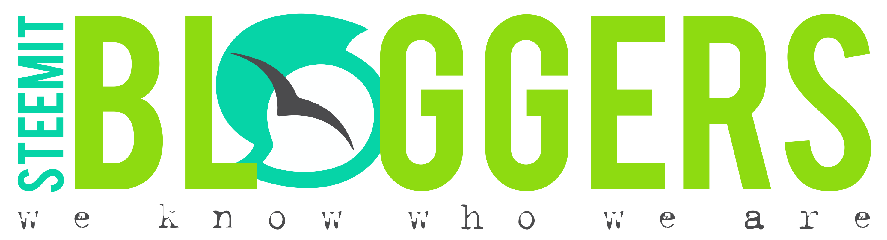
In with the NEW, Out with the OLD - STEEMIT LOGO :)
CHANGE IS AS GOOD AS A HOLIDAY!
There seem to be some mixed feelings about the new Steemit logo,
but quite frankly -
I ABSOLUTELY LOVE IT!
I love the simplicity and even more than that, I love the COLOUR!!!!
Having been in the design field for the last 17 years, it simply felt WRONG to continue posting ANYTHING AT ALL with the branding that was no longer...
Move with the times they say ;)
So to all the members of our amazing server STEEMIT BLOGGERS
Here is our new adaptation for the way forward, alongside
and in support of @steemitblog @steemit...
THE BANNER VERSION
THE ICON VERSION

and for those confused about the "bird"... here is the explanation.... ;)
The funny thing about it though, is that just last night I sat and designed a new logo for our Steemit Bloggers Server lol - completely oblivious (obviously) to the fact that it would change today... haha...
For the fun of it... this was the "old" - "new" version... hehehehe

BUT....
(and it's a BIG but as always...)
I FAR prefer the new look!
So, hats off to the @steemit team ;)
and here's hoping that the Steemit Bloggers team, Like what I have done too... lol
@dragonslayer109 @chron @codingdefined @dreamily @himshweta @mcfarhat @niv @phunke @rodeo670 @theheralds @twotripleow @ajdohmen @ashleykalila @azizbd @bahagia-arbi @battleaxe @claudiaz @collinz @cryptoit @deadsparrow @doyanphotography @dsatria @ehabfox @fararizky @felipesuarez @gunneresq @hubbi @idunique @isacoin @janashby @jemimah @krazypoet @lola.imma @michaelcj @pangoli @playfulfoodie @reddragonfly @robertmuller @samstonehill @sostrin @teukumukhlis @tradersharpe @voyceatlas @bambam808 @gikitiki @meesterboom @theheralds @azizbd @hubbi @isacoin @lacremo-it @lizziesworld @nates @niv @pathforger @acwood @alvinauh @ashleykalila @bre-hamilton @codingdefined @dreamily @dsatria @frogprincess05 @giantbear @gikitiki @mealsonwheels @mughal @pangoli @positivesteem @reddragonfly @richforever @robertmuller @thekittygirl @twotripleow
Until next time...
Much Love from Cape Town, South Africa xxx

ENTHUSIASTIC about BLOGGING?
Got AWESOME content?
well, what are you waiting for?!
CLICK HERE TO JOIN THE STEEMIT BLOGGERS ON DISCORD
Great work! Love what you have done with it here :) Upped & resteemed!
Thank you so much @samstonehill - That REALLY means a lot to me! I am RATHER passionate about Steemit as you have most likely noticed. lol
Apologies for taking so long to respond... I have just had so much going on that I am only sitting down now to get back to everyone xxx
Cheers !
Old logo generally awesome.i think old is best.
The old logo is much more beautiful
Thank you for the compliment @dobartim, but if we are going to be a "steemit" group, we need to carry their symbolism :)
We are all here for money, for love we would write blogs on our web .
We write, lobby, meet and support each other. Someone likes us and we follow him, we reject others as in life, and everyone writes as crazy just to have more dollars - that's true and everything else is poetry - @jaynie
Great. We're a cult now.
lol ;)
Im really digging the new logo and layout
Absolutely!!! :D
I am not generally opposed to change and moving forward, and think many people seem closed-minded in that regard. However, I don't see a connection with the new logo and the concept of the site. The old logo had the appearance of "steam"/"steem" rising, which was perfect. Their new logo looks like a stylized "S" (or a hurricane symbol?). I think I'd feel the same way if Apple® changed their logo to the silhouette of a banana. Of course, the new logo is pretty, no doubt — I'm just not getting the connection to "steem"/"steam" with the symbology like I did with the old logo. Or maybe I'm just missing something and it will hit me in a day or two...!?!?
That being said, though, GREAT JOB on the banner!
Hi @thekittygirl... the change was made because Steemit changed their logo... before I say anymore on it, let me just establish if you are aware of this?
Yes, I was aware of the change to the Steemit logo, and that's what I was talking about, that I can't see the symbology behind their new logo as relates to "steem"/"steam" like the old one did. Unless their new logo is just a stylized "S" for "Steem," perhaps.
Until you brought it to my attention, I hadn't noticed the bird was just your addition over that new logo. The bird is cool, I like it!
Read their post about the logo hon... it explains it all :) https://steemit.com/logo/@steemitblog/the-new-steemit-logo-is-here
Ah! I had not seen the blog post, nor did I even realize there was an official blog for the site. THANK YOU for the link!
wow amazing post
:) thank you
nice new logo and really nice colours, and thanks for the link @jaynie.
Pleasure Hon :)
This is amazing graphic work on your part! :) And I love how quickly you got a new design out so soon after the new logo was released!
Thanks @rodeo670 I appreciate the positive feedback on it! Glad everyone likes it :)