[Steemia] - Logo design - j3dy v1.1c
Details
Created a cool Logo for Steemia a new mobile app for the steem blockchain. You can read more about the project on their blog: https://busy.org/@steemia-io
This app will provide the users an enriched user experience plus features commonly encountered in a casually used social media. The goal of this project is to give the community a mobile app where they can do their daily activity in the blockchain.
https://utopian.io/utopian-io/@steemia-io/steemia-logo-design-request
Updated and 2k again :) This is version 1.1c and I'm overhauling the whole post so I hope the moderators take note.
Icon Request
Horizontal Typeface font is [Roboto] noted below
Vertical Typeface
Black White and Outlined Versions
Size Variations and mockup icons for different use cases
Launcher Icon

48x48 px
 72x72 px
  96x96 px
  144x144 px
  192x192 px
 512x512 px
Action Bar Dialog And Tab Icon
 24x24 px
  36x36 px
  48x48 px
  72x72 px
  96x96 px
Small Contextual Icon
 16x16 px
  24x24 px
  32x32 px
  48x48 px
  64x64 px
Notifications Icon
 22x22 px
  33x33 px
  66x66 px
  88x88 px
Benefits / Improvements
First up the logo uses known forms like the trending line on the screenshot in the main task, it's also representing the distributed nature of the steem network, as well as the social aspect of it :)
I have since updated the logo to be symmetrical based on the comments from the Task Holder and the colors have been changed to contrast the smaller versions better, I do believe it's looking better and better and I hope the hours spent show the quality I've tried to achieve.
The logo should scale both up and down and be easily recognizable
Looking forward to your comments @hsynterkr @jayser @jayserm
and good luck to the steemia Team
Tools
Cinema 4D, Illustrator, Photoshop
It's a long story but I will try and keep it short,
- Step1: Get the idea in your head and grow it until you are happy with the concept
- Step2: Get the vector shapes: Outline or just connect the dots, Vectorise the main elements
- Step3: In my case it's export and setup in Illustrator, produce color variations and setup the scene for export
- Step4: Produce the mockups and general bells and whistles (I'm still not great with effects and gradients so I lack that final polish)
- Step5: Add to the repository/disk/server and Write up the post
- Step6: Do updates based on the feedback received
!!Feedback is one of the most important steps in the process !!
- Step7: :) Update the post and refine the whole spectrum :) Hope for the best :)
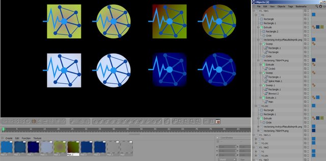
I don't see the point in spamming screenshots but I can stream videos for you next time :)
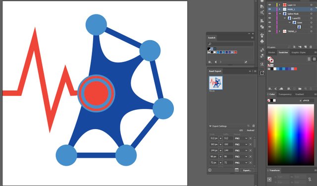
Aditional Mock Ups

Colours
Main colors:
Light Blue
R=33 G=150 B=243
Dark Blue
R=13 G=71 B=161
Red
R=244 G=67 B=54
Variation Colors
R=51 G=51 B=153 / R=51 G=153 B=204
Swatch.ai Included in the V1.1c repository
Original files
Current V1.1c
Download files Here
Obsolete V1
Download files Here
Download Roboto font Here
Cheers, @j3dy
Posted on Utopian.io - Rewarding Open Source Contributors
Много яко лого, оправи си го, за да го приемат! Добро е!
Hello @j3dy,
Thanks for your contribution. I do appreciate all the work done in your contribution but however, after analyzing your work, I am afraid to say that your contribution does not meet the Utopian standard quality. For instance, the symmetry of the design is not even nor proportional. Look at the example below:
In addition, the logo does not scale well. For instance, in small sizes, the logo is not recognizable:
I wish I can accept this contribution but however, I cannot go above Utopian rules. You did follow the task request rules but not the Utopian rules.
I hope you understand the situation and accept the feedback.
Thanks once again for your contribution :)
i did make everything by hand so I haven't used symmetries but that's an easy fix.
I received the same reason for rejection the last time I contributed,
I would beg to differ since I clearly recognise it and I've just seen it once, the general nature of distributed systems also isn't really symmetrical, as in here for instance, my contributions always seem to be lacking in some aspect while they are acceptable to many, 70% of mods don't seem to think so.
So yeah I've done everything by hand so it's normal that there are mistakes and asymmetry. Those little edge connections were cut to outline the circles, but I suppose when I was rushing to make the vectors and the color variations it they quickly became squares.
So yeah how do you make a 2k logo that scales down to 16pixels ....
and with 3 seconds I scaled the vectors up and there are no more mistakes, that it doesn't scale well I'm not sure how to fix other than making everything bigger. Also here is the Symmetric version hah that took a good one hour to make :|
I always accept feedback and generally am quite off put when there isn't any.
Thank you for the review! I have 2-3 more ideas about this project that I would like to share so I would like to get this one cleared off, not that it matters with different mods having different preferences, still I'd like to make 2k logos scale down to 16 pixels and not be a one liner :D
Cheers!
Hello @j3dy,
I've seen that you already fixed the logo. Regarding the size of the logo, a logo should be readable at small sizes (for instance, in an icon). This logo in a mdpi size (48x48) will not be recognizable. Why does it happens? It is because the complexity of the logo. A logo should be simple and memorable. In your case, you did include so many things in the logo making it complex.
Since you've received the same reason the last time, it means that you may need to change the way of thinking about a logo. Everyone has their own style but however, a logo does has guidelines.
Regarding your contribution, it is up to the moderator to decide whether yours does qualify for the Utopian reward.
Thanks :)
Updated the whole post and added the new files, plus I'd like to get your final words on this, since I did double the hours put into this. I hope you saw the other comment below with the new smaller icons, I'd like to know if it's acceptable based on your standards.
This looks smart as fuck, mate. Great job.
Thank you for the contribution. It has been approved.
You can contact us on Discord.
[utopian-moderator]
Hey @j3dy I am @utopian-io. I have just upvoted you!
Achievements
Community-Driven Witness!
I am the first and only Steem Community-Driven Witness. Participate on Discord. Lets GROW TOGETHER!
Up-vote this comment to grow my power and help Open Source contributions like this one. Want to chat? Join me on Discord https://discord.gg/Pc8HG9x