You are viewing a single comment's thread from:
RE: [Steemia] - Logo design - j3dy v1.1c
Hello @j3dy,
Thanks for your contribution. I do appreciate all the work done in your contribution but however, after analyzing your work, I am afraid to say that your contribution does not meet the Utopian standard quality. For instance, the symmetry of the design is not even nor proportional. Look at the example below:
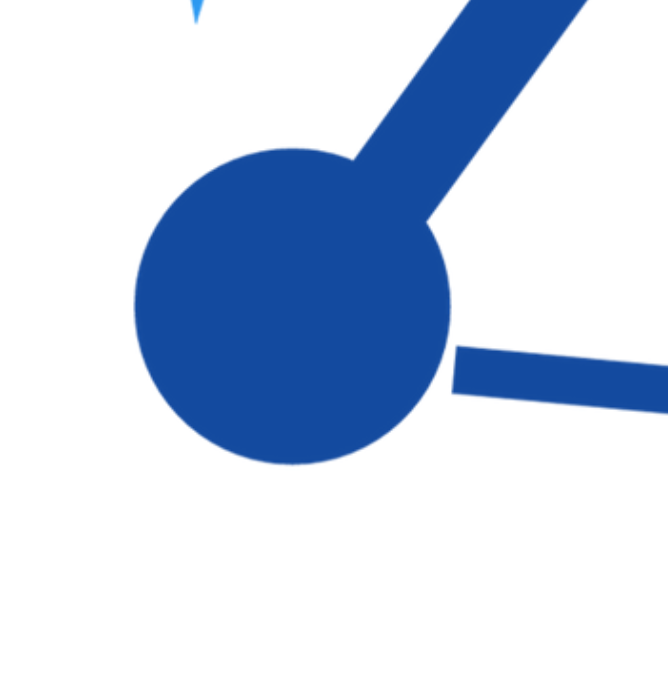

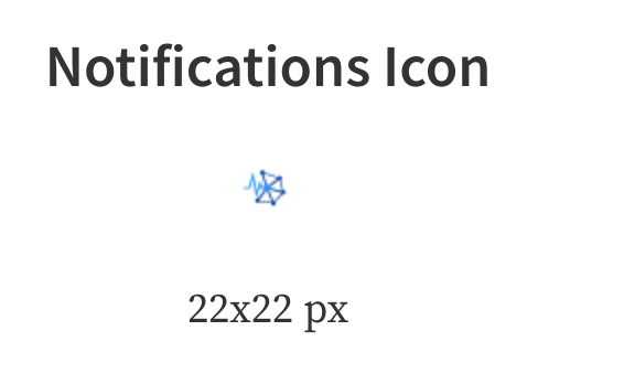
In addition, the logo does not scale well. For instance, in small sizes, the logo is not recognizable:
I wish I can accept this contribution but however, I cannot go above Utopian rules. You did follow the task request rules but not the Utopian rules.
I hope you understand the situation and accept the feedback.
Thanks once again for your contribution :)
i did make everything by hand so I haven't used symmetries but that's an easy fix.
I received the same reason for rejection the last time I contributed,
I would beg to differ since I clearly recognise it and I've just seen it once, the general nature of distributed systems also isn't really symmetrical, as in here for instance, my contributions always seem to be lacking in some aspect while they are acceptable to many, 70% of mods don't seem to think so.
So yeah I've done everything by hand so it's normal that there are mistakes and asymmetry. Those little edge connections were cut to outline the circles, but I suppose when I was rushing to make the vectors and the color variations it they quickly became squares.
So yeah how do you make a 2k logo that scales down to 16pixels ....
and with 3 seconds I scaled the vectors up and there are no more mistakes, that it doesn't scale well I'm not sure how to fix other than making everything bigger. Also here is the Symmetric version hah that took a good one hour to make :|
I always accept feedback and generally am quite off put when there isn't any.
Thank you for the review! I have 2-3 more ideas about this project that I would like to share so I would like to get this one cleared off, not that it matters with different mods having different preferences, still I'd like to make 2k logos scale down to 16 pixels and not be a one liner :D
Cheers!
Hello @j3dy,
I've seen that you already fixed the logo. Regarding the size of the logo, a logo should be readable at small sizes (for instance, in an icon). This logo in a mdpi size (48x48) will not be recognizable. Why does it happens? It is because the complexity of the logo. A logo should be simple and memorable. In your case, you did include so many things in the logo making it complex.
Since you've received the same reason the last time, it means that you may need to change the way of thinking about a logo. Everyone has their own style but however, a logo does has guidelines.
Regarding your contribution, it is up to the moderator to decide whether yours does qualify for the Utopian reward.
Thanks :)
Updated the whole post and added the new files, plus I'd like to get your final words on this, since I did double the hours put into this. I hope you saw the other comment below with the new smaller icons, I'd like to know if it's acceptable based on your standards.